Survey results: UK - Marine Collagen Powder Packaging A/B Testing
Survey Question
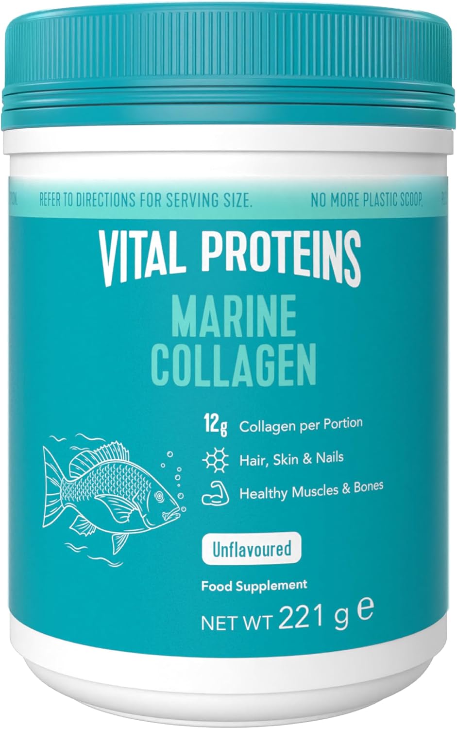
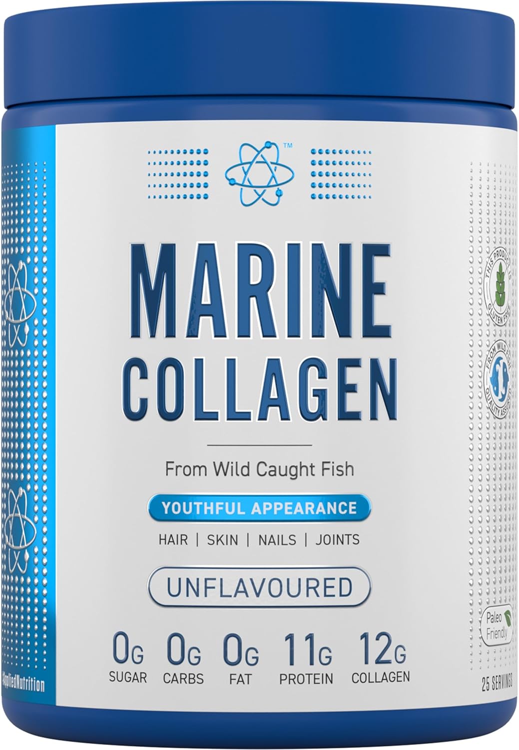
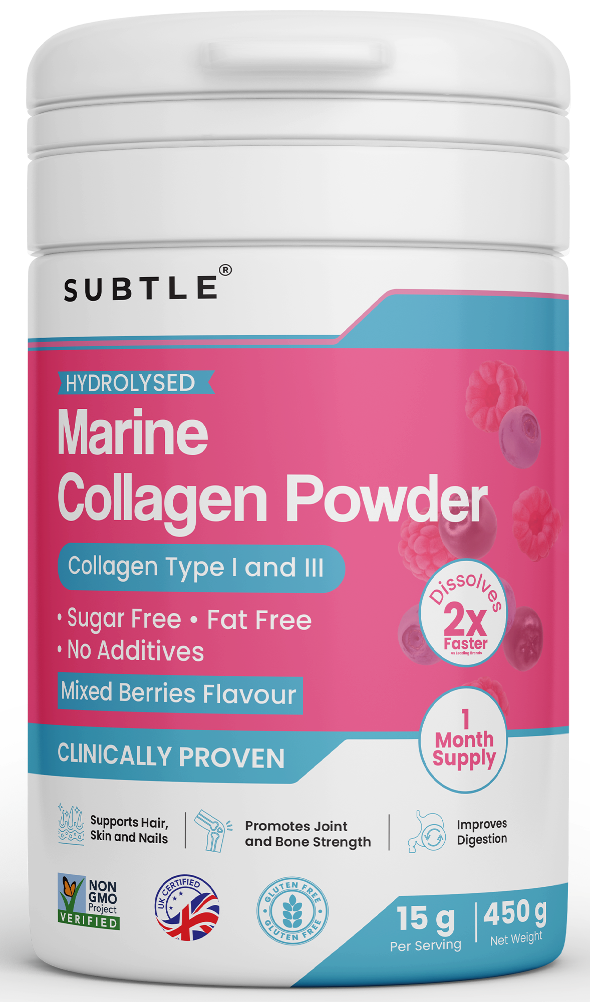
You are looking to buy Marine Collagen Powder and come across the following 3 products. Based on the images, which one would you prefer to buy?
Response Progress
20of 20
Ordered20
Received20
Fulfillment100.0%
Winner
Option C
40.0% of total votes
Runner Up
Option B
35.0% of total votes
Total Responses
20
3 options
Voting Results
Distribution across 3 options
Winner
Demographics
Respondent breakdown by gender & age
Gender Split
20
total
Male65%
Female35%
Age Distribution
Individual Responses
20 responses
F
Female, 27Option A297 days ago
This Product is sugar free, Fat free mentioned in the Box label. Box label color also premium look
What they didn't likeThis Box look is very low quality compare to others. Net weight is not mentioned.
M
Male, 37Option C297 days ago
This product comes from a brand that I know and trust and I know works very well
What they didn't likeThe design of the label is too busy and seems hard to understand
M
Male, 47Option C297 days ago
i like hoe it looks and it looks like you get more
What they didn't likei didn't like the color or the way it's designed
F
Female, 44Option C297 days ago
I think the fish caricature is kind of cute and eye-catching. Plus, I like the colors.
What they didn't likeI think it looks okay but it's a bit boring compared to the other two.
M
Male, 47Option B297 days ago
The black text on white background is easiest for me to read.
What they didn't likeThere was just too much to take in at once. Desgin is cluttered.
M
Male, 72Option B297 days ago
This package has the most professional appearance.
What they didn't likeThis jar is pink, which leads me to believe it is only for women.
F
Female, 47Option C297 days ago
it was having detailed description about the product and it was easy to understand the product better
What they didn't likethere is not much detailed description about the product and color was not attracted me
M
Male, 32Option A297 days ago
I preferred option A because it's packaging easy outlines the active ingredients and benefits of this supplement.
What they didn't likeI thought the label/design of option B was too generic and bland. It did not capture my interest.
F
Female, 37Option C297 days ago
I love the bright teal and all the info is really easy to read and process
What they didn't likethe colors and appearance are all over the place and overwhelming
M
Male, 55Option B297 days ago
Easy to read areas of benefit (hair/skin/nails/joints)
What they didn't likeNot a fan of deep pink color -- it's kind of nauseating