Survey results: Tosoro A+
Survey Question
Which design template is more appealing and effectively showcases the product's features and benefits?
Response Progress
50of 50
Ordered50
Received50
Fulfillment100.0%
Winner
Option A
52.0% of total votes
Runner Up
Option B
48.0% of total votes
Total Responses
50
2 options
Voting Results
Distribution across 2 options
Winner
Demographics
Respondent breakdown by gender & age
Gender Split
50
total
Male38%
Female62%
Age Distribution
Individual Responses
50 responses
F
Female, 40Option B578 days ago
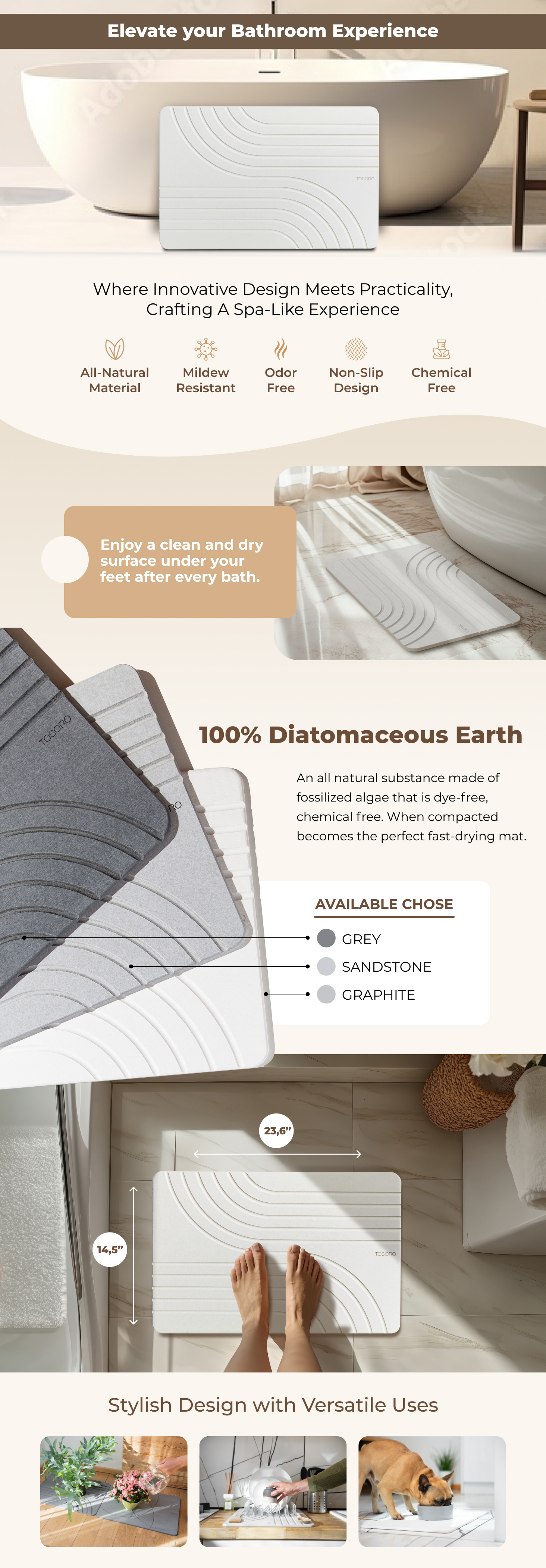
I have a better idea about the product with B. It feels more thorough.
What they didn't likeThere is nothing wrong with it, it just isn't as good as B.
M
Male, 29Option B578 days ago
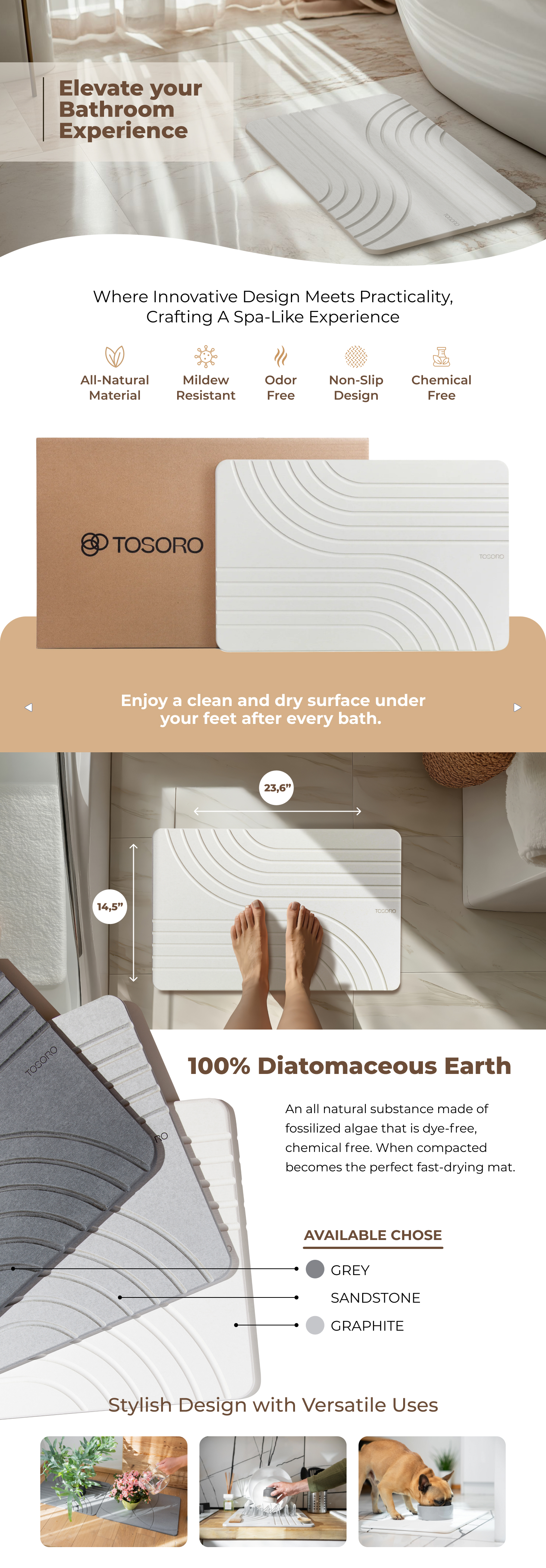
Pretty the light beige background colors, shows a bathroom image at top where this is commonly used
What they didn't likeA feels a bit bland with white background and model images are a bit off
F
Female, 55Option B578 days ago
I like the symmetry of the design in the top image of Option B.
What they didn't likeThe design at the top of Option A seems too dynamic and off balance.
F
Female, 38Option A578 days ago
The way this set of pictures is introduced is so gentle and airy. It’s just more attractive and high end curated.
What they didn't likeI don’t dislike this option, I still think it looks nice and appealing, I just love how the other set of pictures starts out more
F
Female, 51Option A578 days ago
I like option A. The top picture is interesting as there is more to look at and that will immediately get your attention. I also like the colors as they are softer and make the product stand out more.
What they didn't likeThe top picture is a little dull and uninteresting. The colors are also too dull.
M
Male, 31Option A578 days ago
I prefer having the highly visible branding in the copy because it makes it seem more genuine.
What they didn't like"Available chose" is not good English, maybe "Available colors" is better. This is also in Option A.
M
Male, 44Option A578 days ago
A actually shows the bathroom mat clearly in action at the top and shows the dimensions sooner without extra vertical scrolling.
What they didn't likeB is my top choice because it pushes some of the key content further like shots of the mat in action. I like seeing the materials higher up in the information, but ultimately I'd rather see the dimensions first as I would evaluate that before anything else.
F
Female, 47Option A578 days ago
I slightly prefer the layout and colors in Option A, especially the white background underneath the main image which provides a really appealing color contrast with the symbols in this area.
What they didn't likeThere's not as much appealing color contrast between the images/text and background in this option.
M
Male, 39Option B578 days ago
I think this option shows a lot of illustrations on what this product can do compared to the Option A
What they didn't likeIt's still a good representation but I just like Option B better.
M
Male, 25Option B578 days ago
I liked the product design shown in letter B the most because I found the image to be simpler and more elegant and it gave me a very positive visual impact.
What they didn't likeFor this purpose, I found the image shown in letter A to be a little flashy because it looks very elegant for rugs. I think simpler images are better.